e.v.e.r.y.t.h.i.n.g e.l.s.e
m.i.s.c.e.l.l.a.n.e.o.u.s a.r.t.w.o.r.k
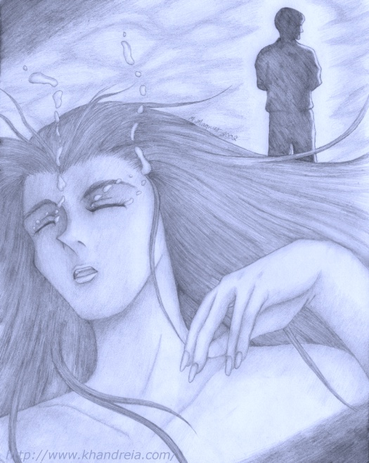
[CG-ed version]"Drowning in Tears"
It's rare that I draw something that shows my true inner emotions, but this is one of those such pieces. In early March 2002, I'd gone through a terrible case of heartbreak over someone who I loved more or less abandoning me, and for a considerably long time after that, he would still not acknowledge my feelings, leaving me to more or less suffer in silence. Just by that, I think you can more or less determine the symbolism of the various elements of the drawing. The woman shown, of course, is supposed to be a representation of myself, and the silhouetted figure in the background turned away from her is of course represents the person who broke my heart and the way he seemed to ignore what I was feeling. Drawing this was very difficult for me, not from the drawing part of it, but because of what it was supposed to show.
[3/31-4/6/2002, 11"x14"/132 KB, pencil w/ CG-added blue-tone]
"Human Touch"
Technically this should be listed on the Gundam X page, but I honestly don't know how I'd explain it being there without looking like a complete fool. Anyway, this is more or less fic-art for another group fic my friends and I were writing called "Between the Lines, Between Two Hearts" (or just BtLB2H for short), the plot of which is kinda hard for me to explain in one sentence. This was supposed to be related to the part I was writing for it, and the title of this piece comes from the song "Human Touch," which is also Gundam X's first ending theme and is very important in my part as well. Nearly all the lyrics for the song (I couldn't fit in the last chorus, otherwise the text would've been way too small and hard to read) are even included in the background because of this. (And it was already in English, so I didn't have to translate anything.) But that's not why I say it should be with the GX art; it's really because one of the characters featured in this is from that, though it's not very obvious because both people featured in it are silhouetted. To anyone else this could easily be just a regular romantic picture of any given man and woman. And to be honest, this really isn't as much fan art as it is manipulation of graphics. I had to draw out the silhouette first (which was a pain because I didn't have any images to really go by), scan it, paint it black, stick it on a pretty background, and put in the text, all of which took me less than 24 hours to do. But no matter what, I really like this picture; the background I found is simply beautiful with those rose and purple tones, and my subjects are nicely positioned against it so that it looks like those rays of light are coming out around them.
[12/16/2000, 61 KB, CG]
Anime-style self-portrait
Here's something you don't see from me all that often--an unfinished drawing. I'd been wanting to do a somewhat stylized anime-style drawing of myself (I made myself a little thinner and gave myself wispy bangs so it wouldn't look weird), but when I got around to drawing the hands on this, I completely gave up because I suck at drawing hands. But anyway, this is a good example of how all of my anime drawings start out before I clean them up with a pen outline and then color in--lots of rough pencil lines and eraser marks all over the place. ^_^;; The scan isn't all that great around the edges either, but that's because I was trying to scan a part of an 11"x14" piece of paper when the scanner only shows a 9"x12" area. Maybe one of these days I'll find a way to alter it and then CG it or something like that. But I like how I drew the eyes . . .
[11/2000, 75 KB, pencil outline]
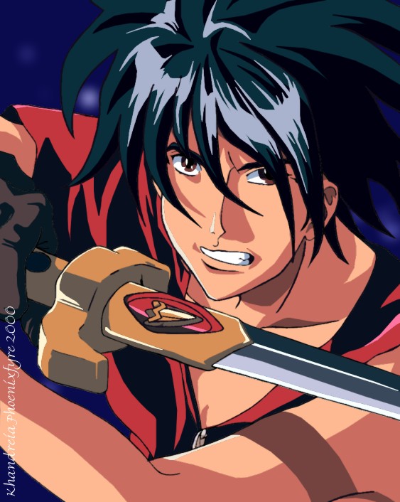
"Comin' Atcha!"
All right, it's kind of a lame title, but it's still fitting for my first-ever drawing related to Escaflowne. It's of Van, one of the main characters (and the only character they didn't screw up in the dub), in a sort of action shot where he's basically coming at you with his sword. I really like how this turned out though; this might just be my best CG-painted picture yet with all the varied colors and shading too. (Of course, I think listening to my Escaflowne movie soundtrack a lot while working on this helped since I got it the day I started this, but that might just be me. ^_^)
[9/23-24/2000, 11"x14" original/95 KB, pen & CG]
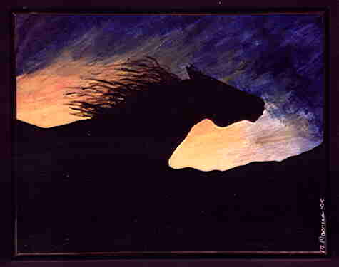
"Sunset Silhouette"
This was one my first pieces to receive any kind of recognition that I had done in a high school art class, a painting of a running horse against a sunset. I've never been all that crazy about this painting, but everyone else seems to like it for some reason. Go figure.
[1/95, 16"x20" unframed/8.57 KB, acrylics] *Blue Ribbon Winner [4-H Division], 1995 Sheboygan [WI] County Fair *Grand Champion Painting [Age 12-15 Division], 1995 Wisconsin State 4-H Horse Expo
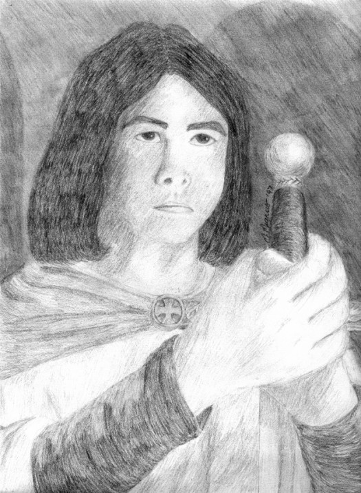
"Rite of Passage"
This is one of my long-standing favorites, based partially on some fantasy-type story that's been brewing in my head for years but I still haven't written down. It started out at a small piece of another drawing I did, but then I went and did a larger rendition of it on its own. You can really see a lot of the details in the sword here, one of my favorite aspects of this picture.
[6/29-30/97, 9"x12"/136 KB, pencil] *Blue Ribbon Winner [4-H Division], 1997 Sheboygan County Fair
"Childhood"
A fairly sentimental favorite in my family, this was actually based on a photo my dad took of me when I was probably 2 or 3 years old. I had to do some retouching on the photo because the original version got kinda smudged when it was taken in to be framed, but I still really like how it turned out even though I rarely ever work in this medium.
[6/96, 9"x12" unframed/18.8 KB, oil pastels] *Blue Ribbon Winner [4-H Division], 1996 Sheboygan County Fair
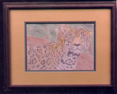
Untitled drawing of a jaguar
I don't remember why I decided to do this one; I guess I had just found a nice photo and thought it would be interesting to try to draw it. But I like how I did the background and the overall color scheme in it.
[5/96, 9"x12" unframed/27 KB, colored pencils] *Blue Ribbon Winner [4-H Division], 1996 Sheboygan County Fair
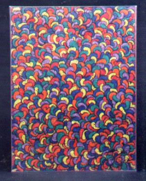
"The Jellybeans Have Revolted!"
The title doesn't totally fit, because they don't even look like jellybeans, but it just seemed appropriate for something this surreal. And yes, it really does look like that; it was an art class project that got out of hand and was a pain in the rear to draw and then color in.
[2/97 (?), 18"x24"/57 KB, felt-tip markers] *Blue Ribbon Winner [4-H Division], 1997 Sheboygan County Fair
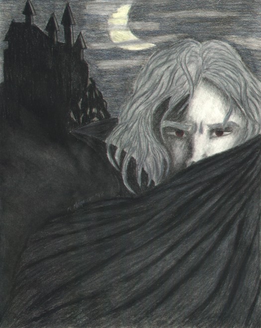
"Come the Dark"
This one started out as a project for my English/Classic Literature class during my senior year of high school after we had read Dracula, and I decided to get creative with it afterwards. Needless to say, I easily got an A on it, not to mention quite a few positive comments from my classmates.
[5/98, 11"x14"/92.6 KB, charcoal w/ colored pencil accents] *Blue Ribbon Winner [4-H Division], 1998 Sheboygan County Fair
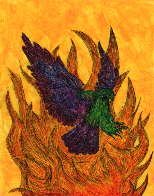
"Into the Inferno"
It may have a slightly Ronin Warrior-influenced title, but that has nothing to do with this piece because this is actually supposed to be of a slightly stylized phoenix. It's really different because of how I did the main image on the front of the tracing paper and did the painting on the back. It looks really cool when you hold it up to the light; too bad you can't see stuff like that in a scanned version. And just recently I discovered that the original drawing of this is irreparably damaged (there's now a small tear right in the middle of it), so consider yourself lucky that you can see it at all here).
[1/97, 11"x14"/141 KB, colored pen w/acrylics] *Blue Ribbon Winner [4-H Division], 1997 Sheboygan County Fair
"The Strangest Dream XI: 'I can't let you see me like this'"
This came from a really weird dream I'd had a few years ago, and this was one of the scenes that stuck with me the most. I incorporated a similar scene into my PR fic "White Knight," but this has nothing to do with it; it's related to an original story I once thought up, called "The Silver Angels," but have never done anything with. I'm going to have to eventually re-scan this because I don't like the retouching I originally did.
[12/97, 5"x8.5"/16.8 KB, pen shading w/ colored pencils]
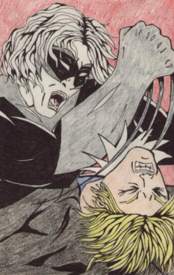
"The Strangest Dream XIII: The Lion Strikes"
This is one of the heroes from "Silver Angels," called the Silver Lion. I had been on this real comic book-style kick for a while when I did this, so it doesn't look quite like my normal style. But I had fun with this one, especially in making the baddie in this look like one of my real-life enemies from high school; I can't even begin to tell you how cathartic doing this drawing was for me at the time. ^_^
[12/97, 5"x8.5"/36.3 KB, pen outline w/ colored pencils]
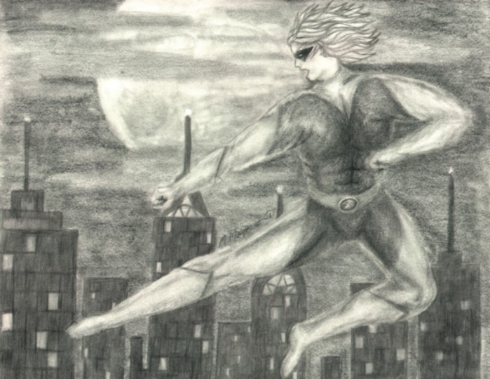
"The Strangest Dream XIV: Nightstrike"
I just about like to consider this Silver Lion (with a slightly redesigned costume) drawing as like the "cover image" to my "Silver Angels" concept. It's just got that feel to it with that nighttime skyline background and the nice definition on the costume too. And this was the only piece related to this concept that I've ever shown off publicly either.
[7-8/98, 9"x12"/95 KB, pencil] *Blue Ribbon Winner [4-H Division], 1998 Sheboygan County Fair
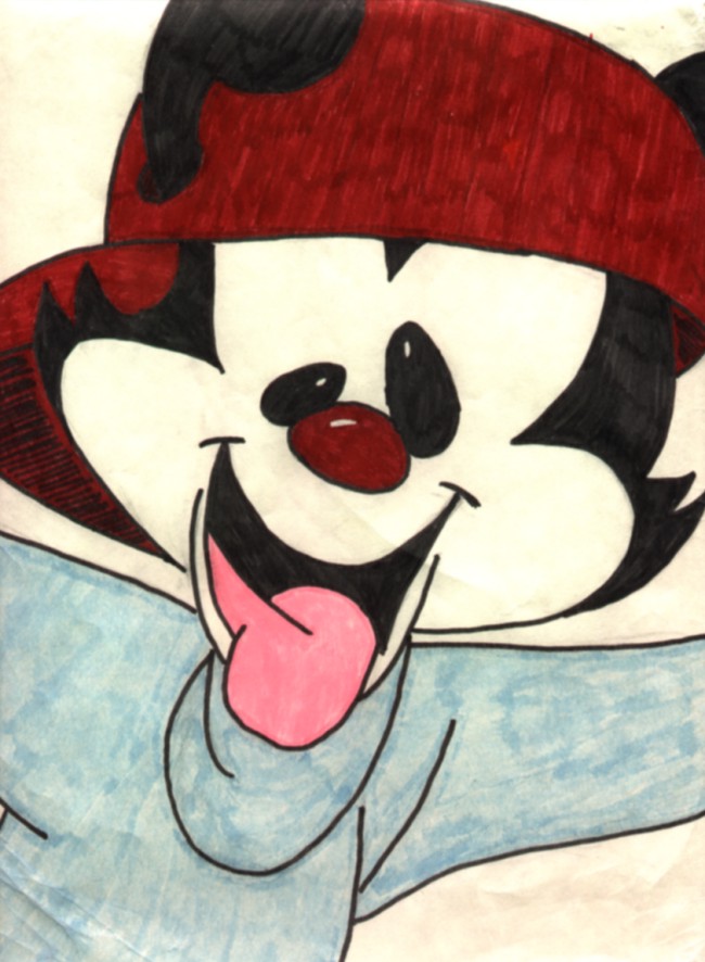
Wakko from "Animaniacs"
The oldest of my drawings that I've got up here right now (you can probably tell just in the quality of the image itself), and it was also one of the first signs that I was good at drawing animated characters. It was meant as a reference drawing for a Halloween costume that I had been planning that year, and I also later traced this and painted it onto a T-shirt.
[10/94, 9"x12"/104 KB, felt-tip markers]
Anastasia
From the animated movie, and based on a small picture out of the soundtrack's liner notes. I'm really upset that the scanner washed out a lot of the light shading on this, but that might be a little bit from the age of the drawing too. (And it doesn't really have that yellowish tone to it either. *thwaps scanner*) Either way, it's still nice.
[11/97, 9"x12"/158 KB, colored pencils]
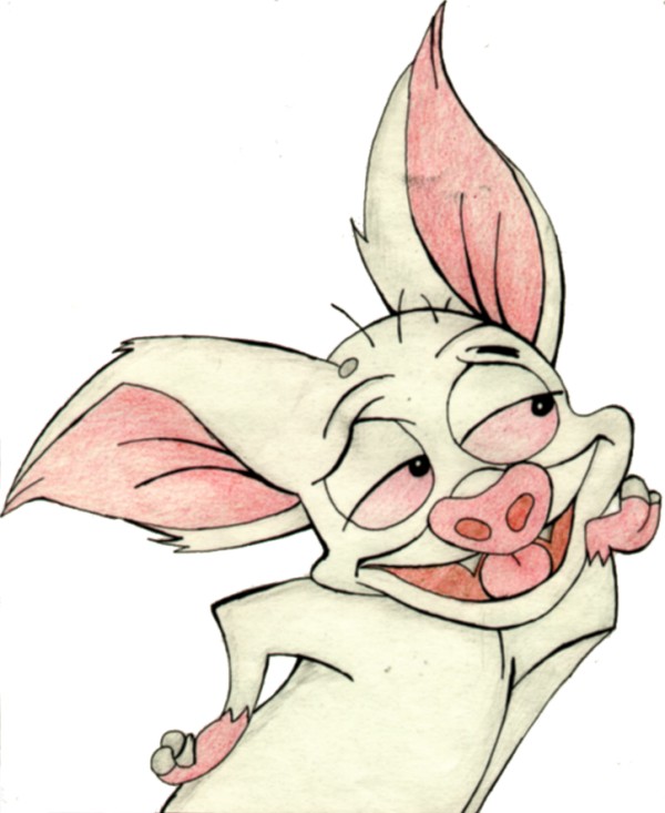
Bartok the Bat from "Anastasia"
I just sorta did this one on a whim from a sticker that came with the soundtrack, but it turned out looking really close to the original image. Sorry about some of the smudges on some parts; that's from a couple years of handling it a lot before finally scanning it.
[11/97, 64.7 KB, pen outline w/ colored pencils]
c.o.m.p.u.t.e.r g.r.a.p.h.i.c.s
The "Inferno Phoenix"
I had originally designed this image of a semi-stylized phoenix for a Ronin Warriors fic series that never got off the ground, thus its "Inferno Phoenix" name, but since then I've decided to more or less adopt it as my own personal logo. I almost consider the phoenix as my astral totem spirit, as it represents rebirth and change, something I've done a lot of in the last few years. I still remember how I'd really quickly sketched out the basic design for this in a matter of minutes during my college Japanese class back in January 2000 all on a whim. It's also clearly one of my very early attempts at designing my own graphics, as it doesn't look as 3-D as it could.
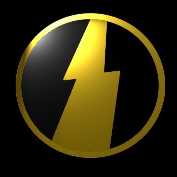
The Samurai Troopers' Yoroi Symbols [Rekka/Wildfire, Tenkû/Strata, Kôrin/Halo, Kongô/Hard Rock, and Suiko/Torrent]
These were my very first attempts at semi-original graphic designs in late 1999/early 2000. Because I couldn't find any good images of the Troopers' armor symbols to use in the Ronin Warrior wallpapers I'd made, I decided to make them myself. Sure, they're not perfect, but they're good enough for me. And trust me, making those was certainly not as easy as it looks like it was, especially the ones that have a lot of curves and whatnot in the designs; I didn't know a whole lot about CG graphics at the time I made them.
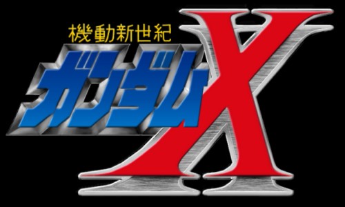
The Gundam X Logo
Here's really good proof that I have far too much time on my hands! This is my most recent (December 2000) attempt at graphic design, based on the version of the Japanese logo shown on the model kit boxes, and you can see a big difference between this and my previous graphics. And I tell you, making this was not easy, especially the small kanji on the top, but it still turned out rather accurate if you ask me. I don't know if anyone would want something like this or not (if you want to use it for a site, please ask me first!), but I might use it for maybe any Gundam X-related wallpapers or other similar graphics I might want to do. Oh yeah, if anyone's wondering, no, I don't plan on doing anything like this again for quite some time . . . o_O;;